Selected work05 / 092024 — 2025
S4E
Cyber-security platform: website, onboarding & web app
Sign-ups went from 12–15% of visitors to 40–45%: three times as many members from the same traffic.
- Client
- S4E, via Aldacı
- Years
- 06.2024 — 01.2025
- Role
- Senior UX designer
- Scope
- Website redesign, onboarding flow, web app, design system · UX & front end
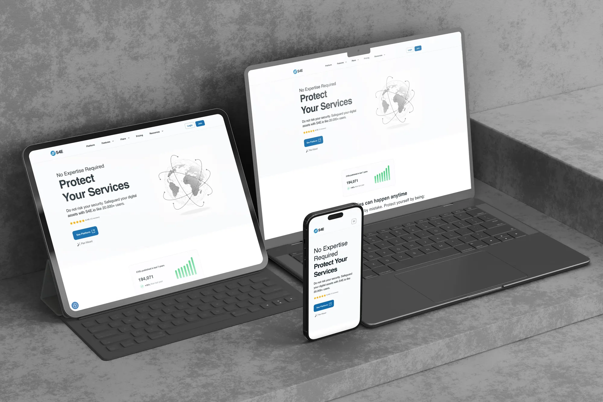
S4E sells automated security scanning to people who are not security experts. The site had to make that promise at a glance, and the onboarding had to keep it.
Over six months I redesigned the website and the onboarding flow, designed the product dashboard and the design system underneath, and built the front end.
Website redesign
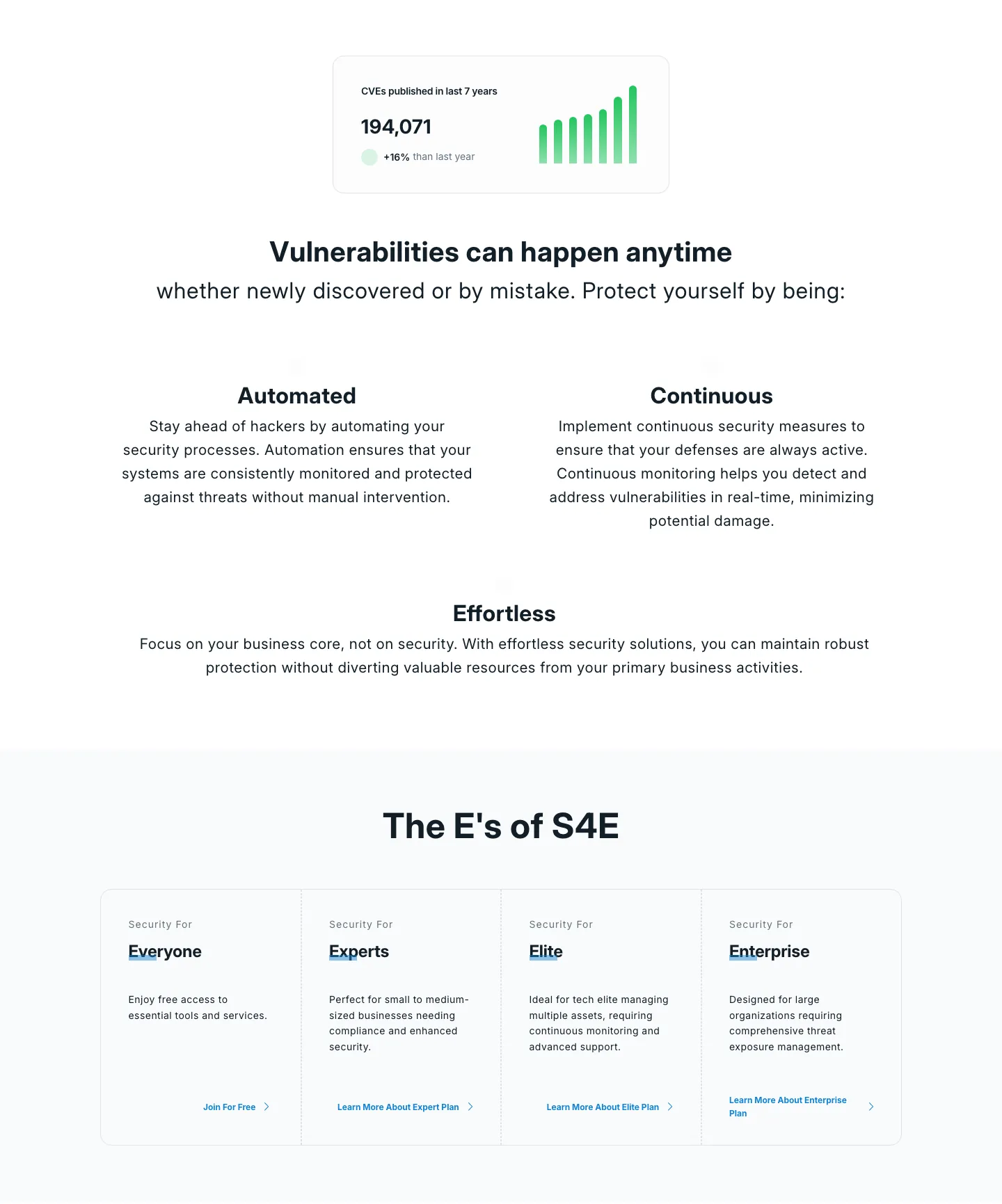
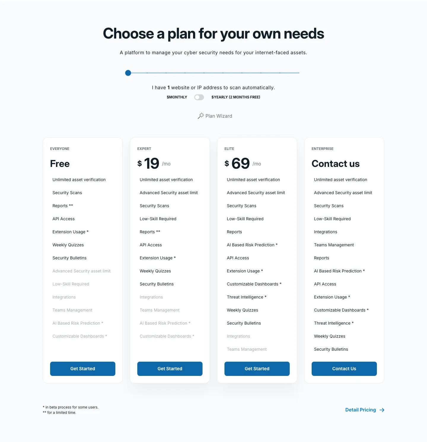
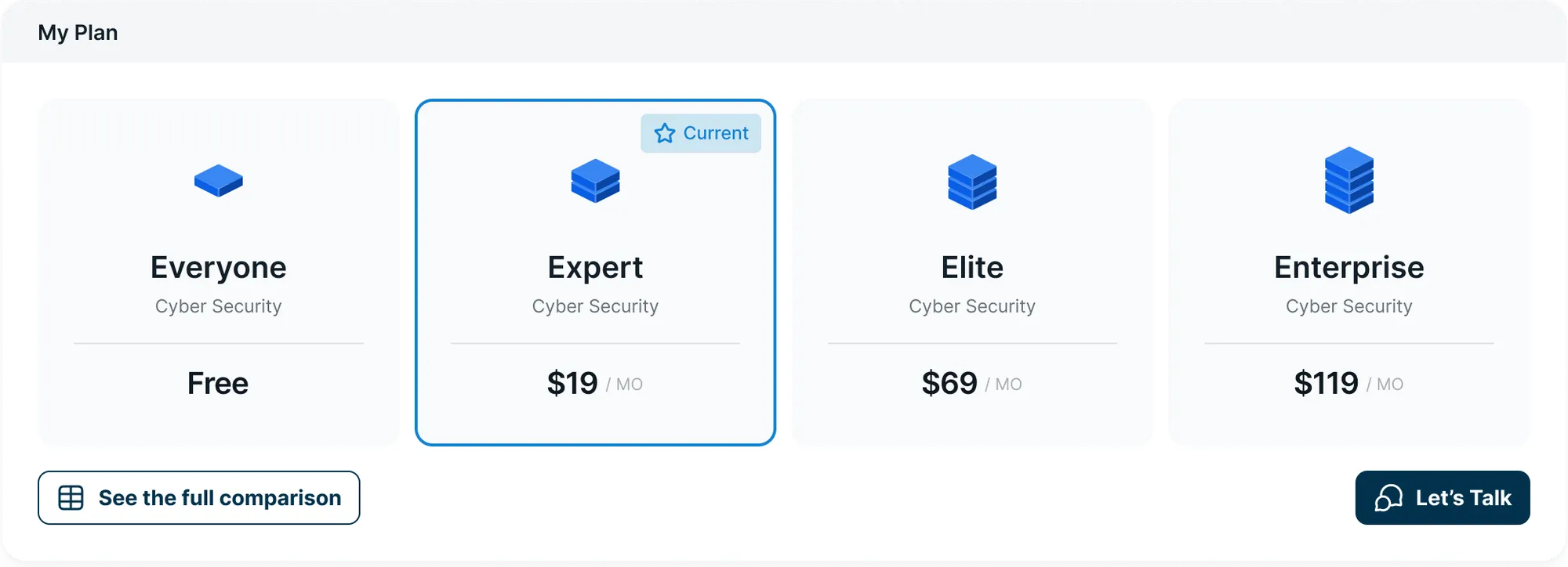
The pitch reads top to bottom: no expertise required, a live count of known vulnerabilities, three promises (automated, continuous, effortless) and a plan picker sized by how many assets you need to protect. Captured from the March 2025 archive of the site.
Onboarding
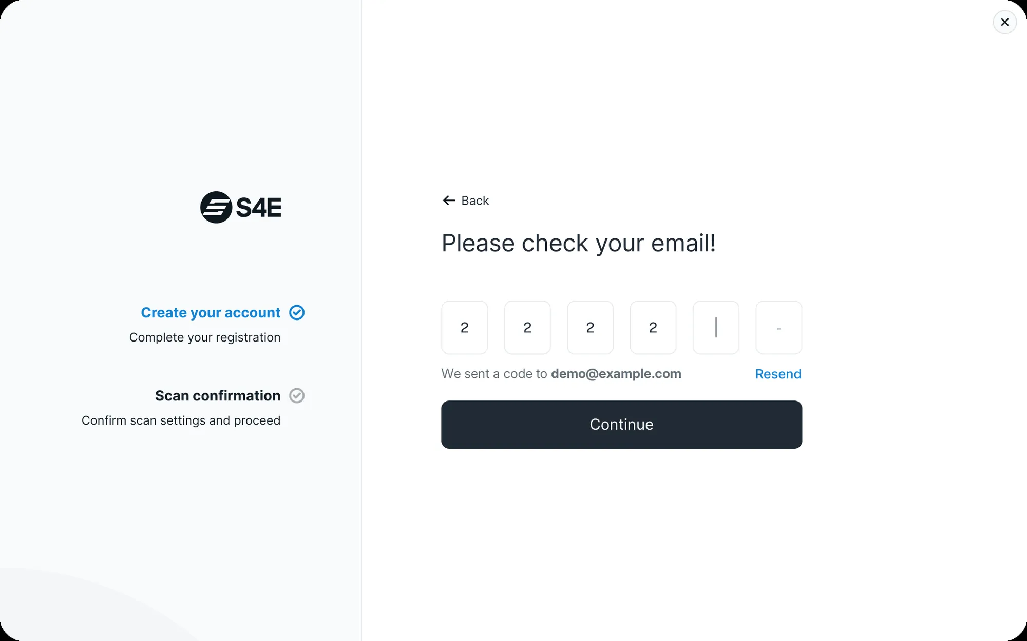
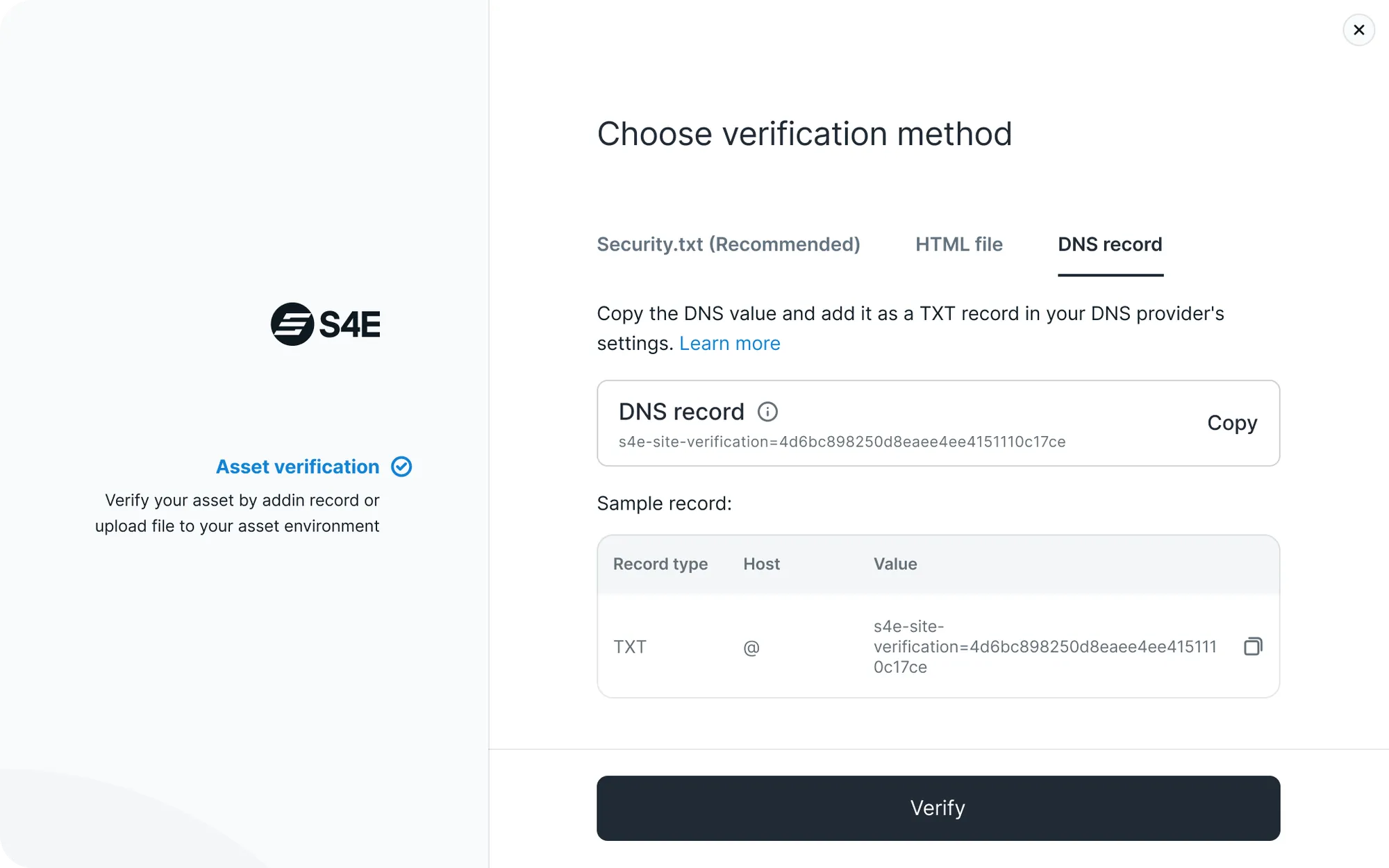
The sign-up is where the numbers moved: visitor-to-member conversion went from 12–15% to 40–45%. Three steps, each on one screen: confirm the email, prove you own the asset, confirm the first scan.
Web app
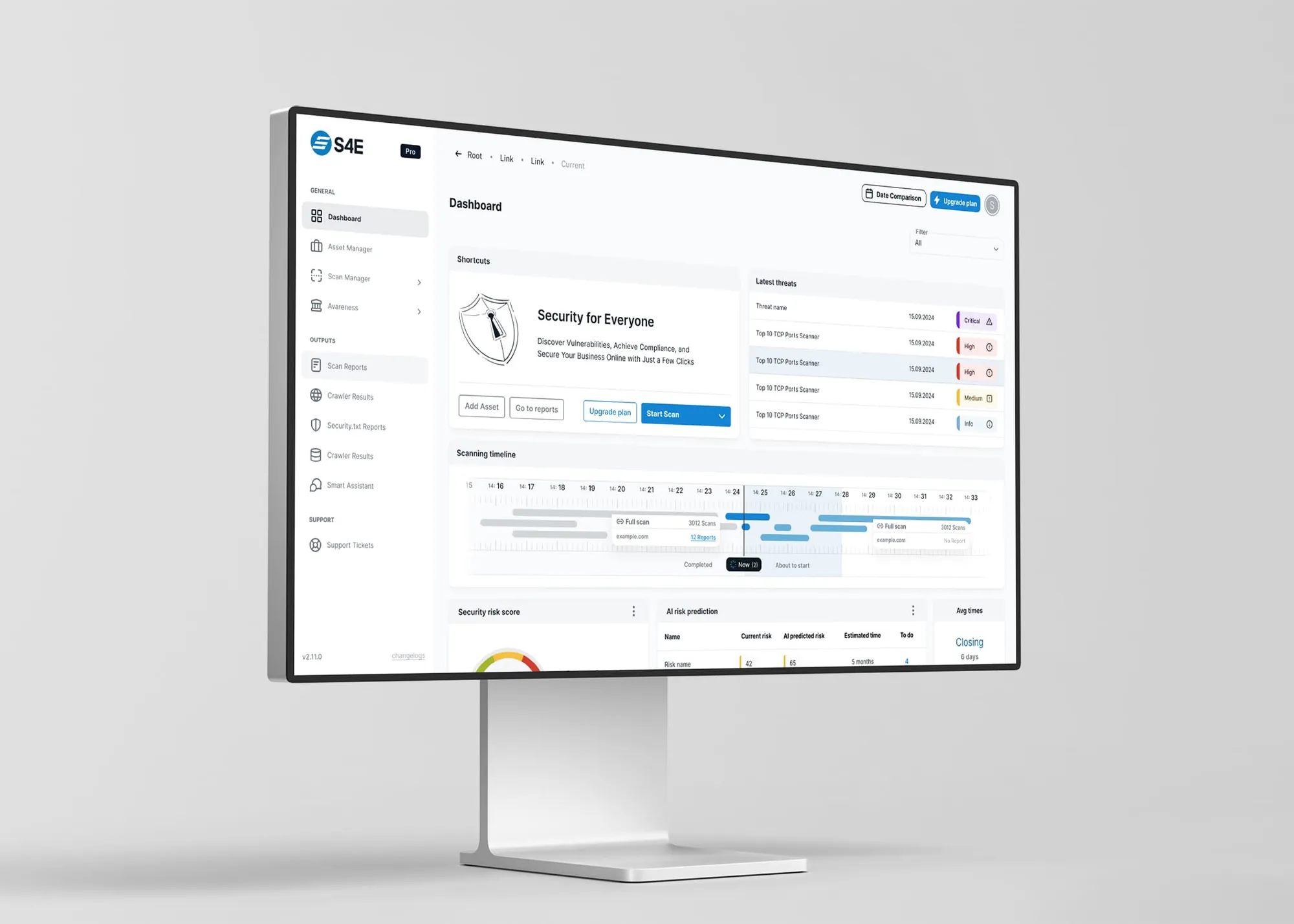
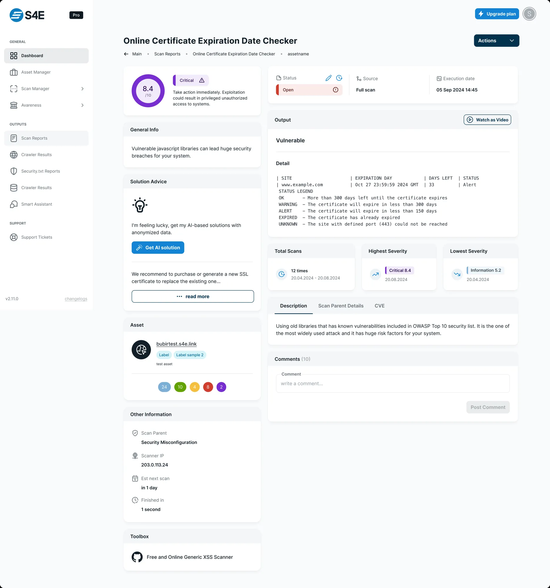
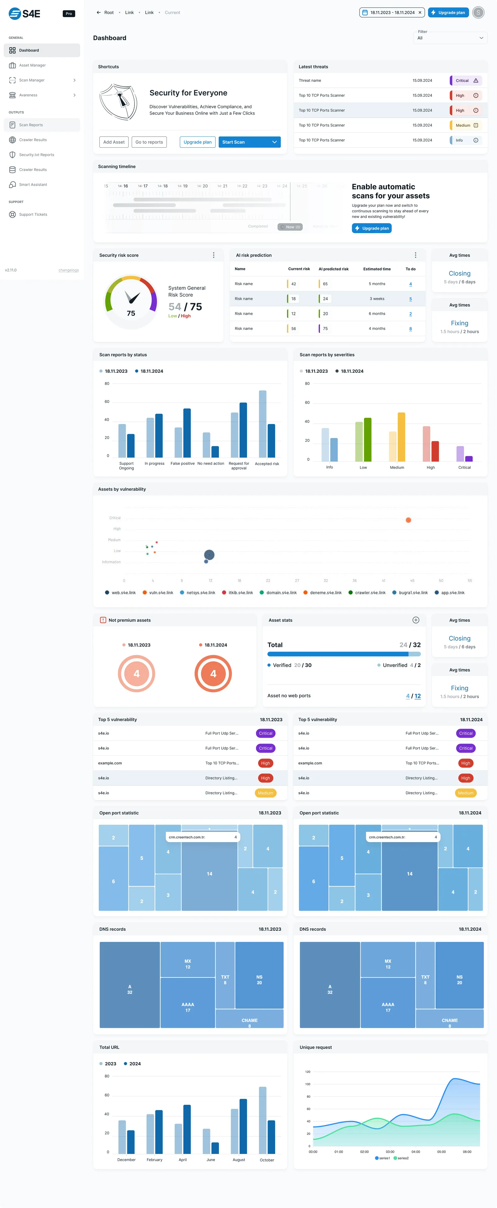
The dashboard leads with what matters: threats tagged by severity, a scanning timeline, a risk score and a one-click scan.
The method behind it
#1483D2app blue#0F69AAsite CTA#121F28ink#2DC866signal#F9FAFBpageOne promise, kept. The hero says no expertise required; the onboarding, the plan picker and the dashboard all had to hold to it.