Selected work03 / 092015 — now
Birtech
Brand architecture for an infrastructure-monitoring company · rebrand, product logos, packaging, 3D
The parent logo, the product logos under it, from Noctua to SensPoint, and the boxes, catalogues and renders in between: eleven years, start-up to enterprise.
- Client
- Birtech Technology
- Years
- 2015 — now
- Role
- Multidisciplinary designer → rebrand lead
- Scope
- Identity & guideline, packaging, catalogues, 3D product renders, sales decks
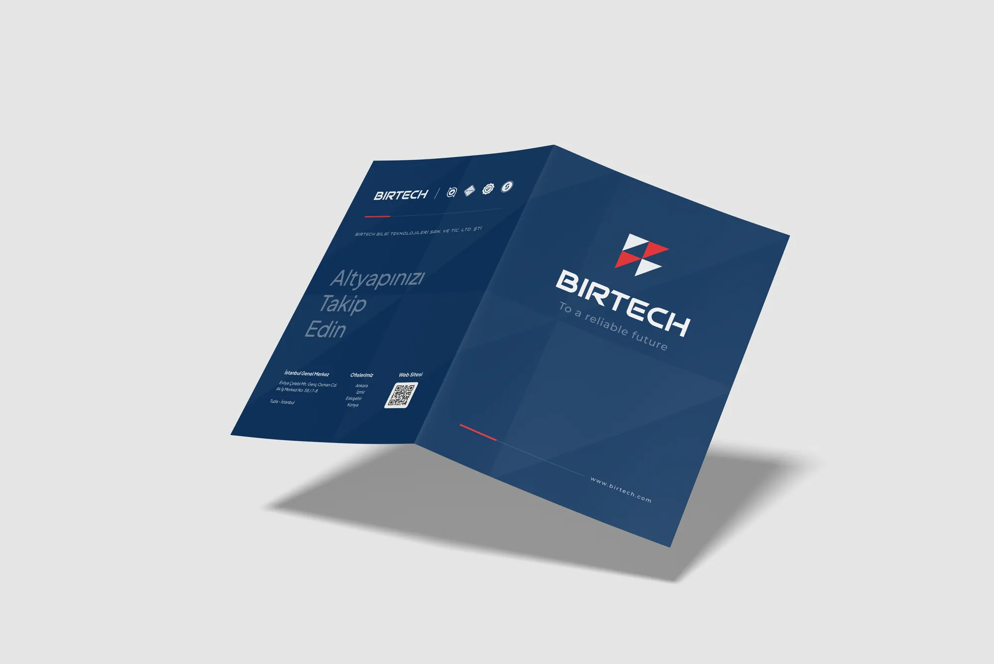
Birtech builds hardware and software for environment monitoring and infrastructure management, from the devices in the rack to the platform that watches them. I joined in 2015, when it was a start-up, and have shaped how it looks ever since, while it grew into an enterprise.
The work runs from the smallest surface to the largest: device labels and boxes, product catalogues, 3D renders of hardware, merchandise and, in 2025, a full rebrand with a new guideline.
2025 rebrand & guideline
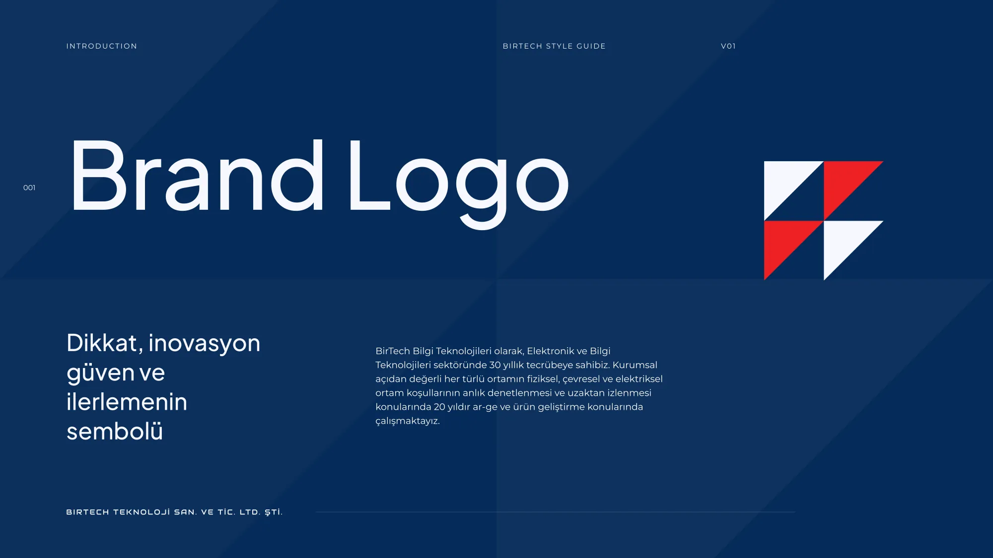
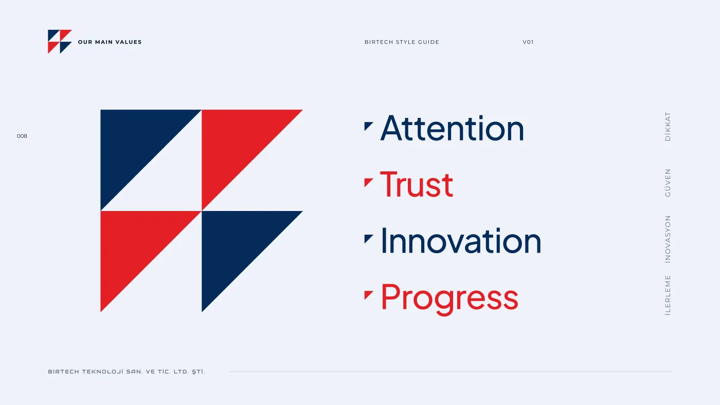
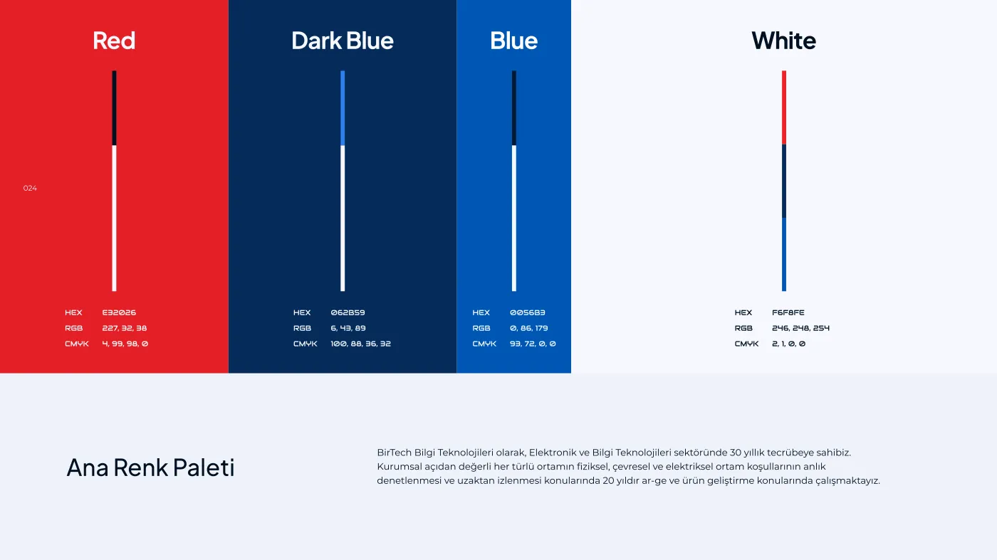
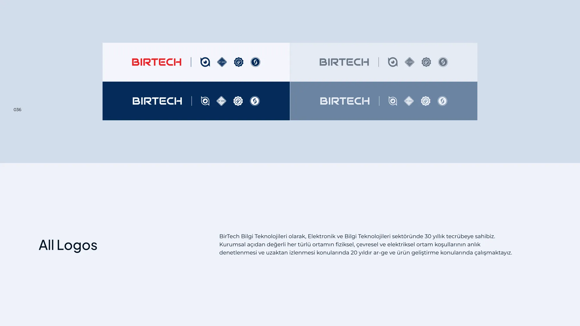
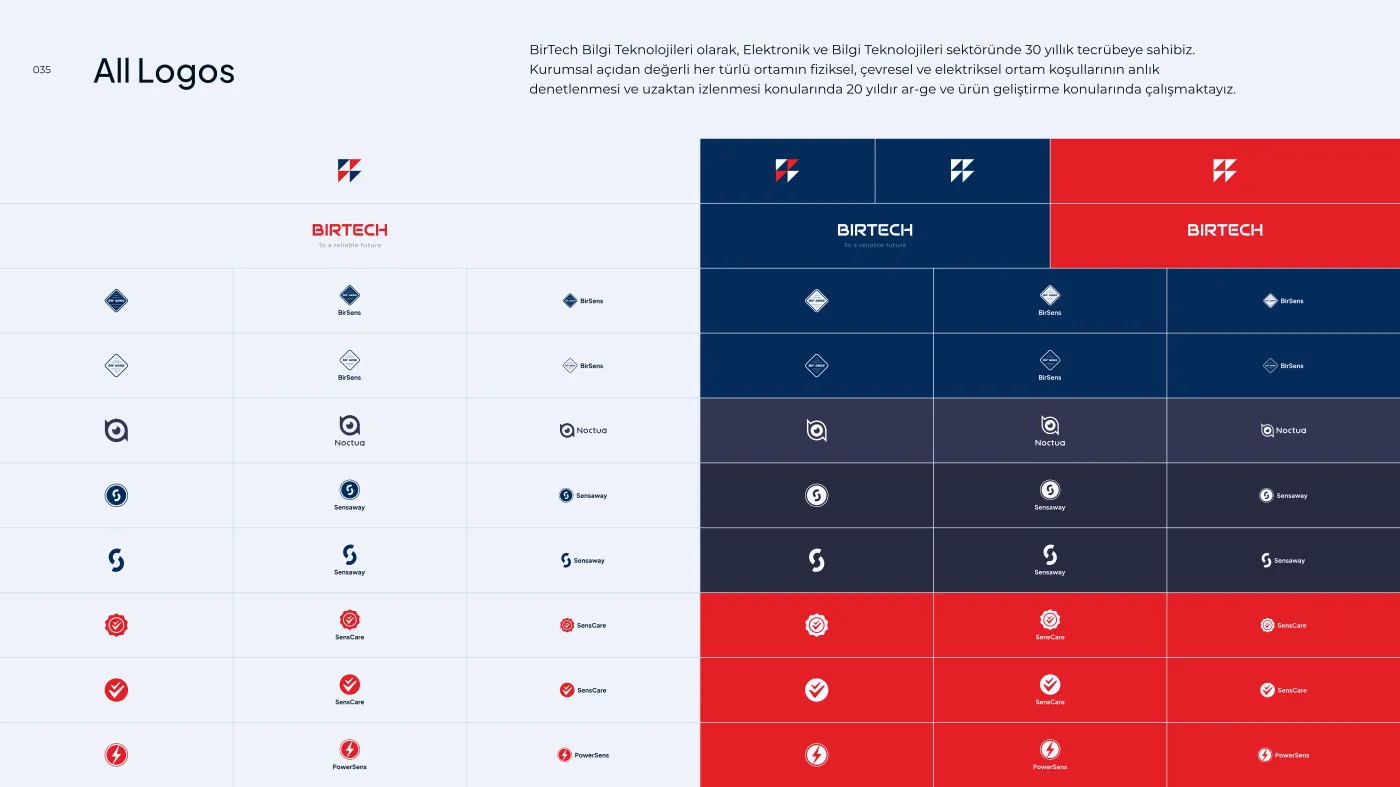
In 2025 the old B1R TECH wordmark gave way to a new logo: four triangles, one for each value the company wanted to stand on (attention, trust, innovation, progress). The guideline fixes the palette for print and screen and brings five product brands, Noctua among them, under one logo system.
Stationery & merchandise
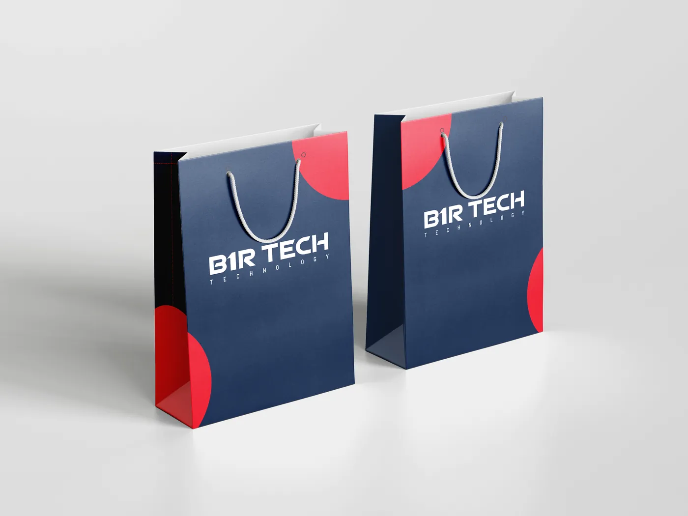
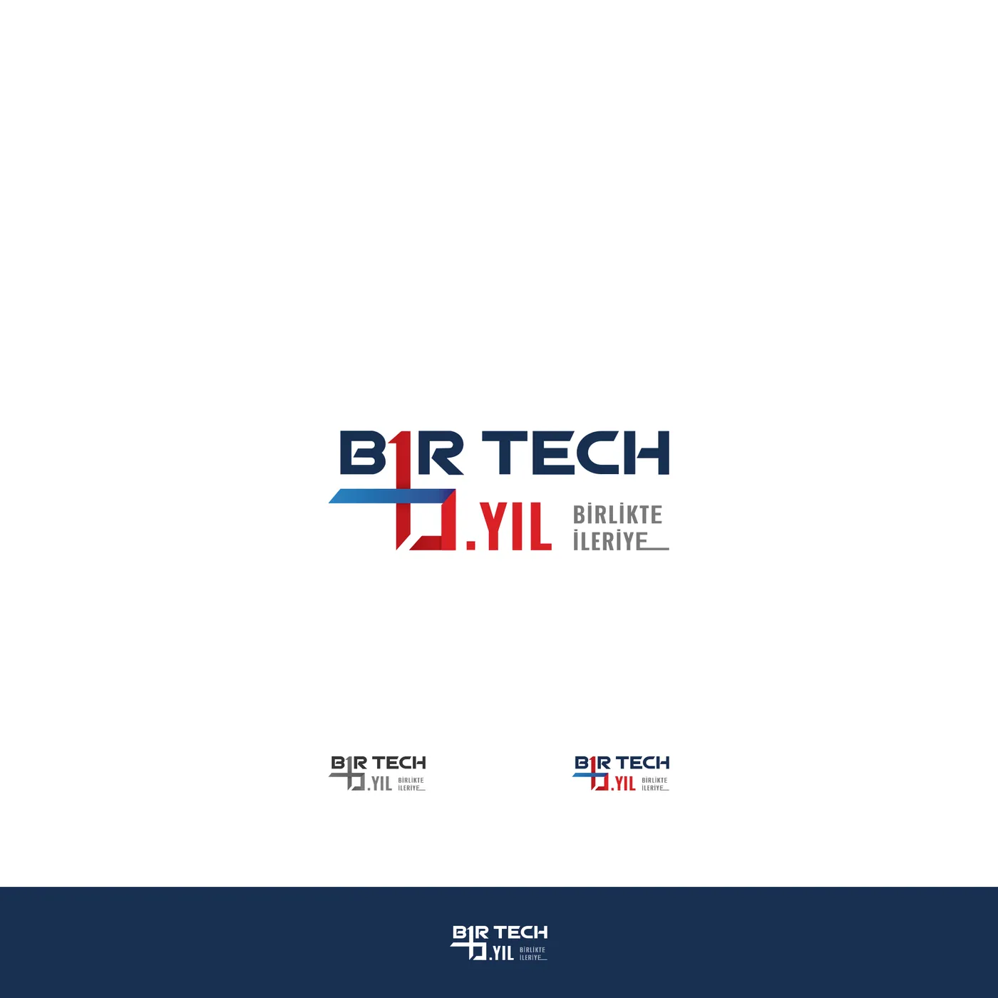
Before the rebrand, the same navy and red already carried the brand onto bags, mugs and stationery. For the company’s tenth anniversary I drew a badge around the slogan “Birlikte İleriye”: forward together.
Device packaging
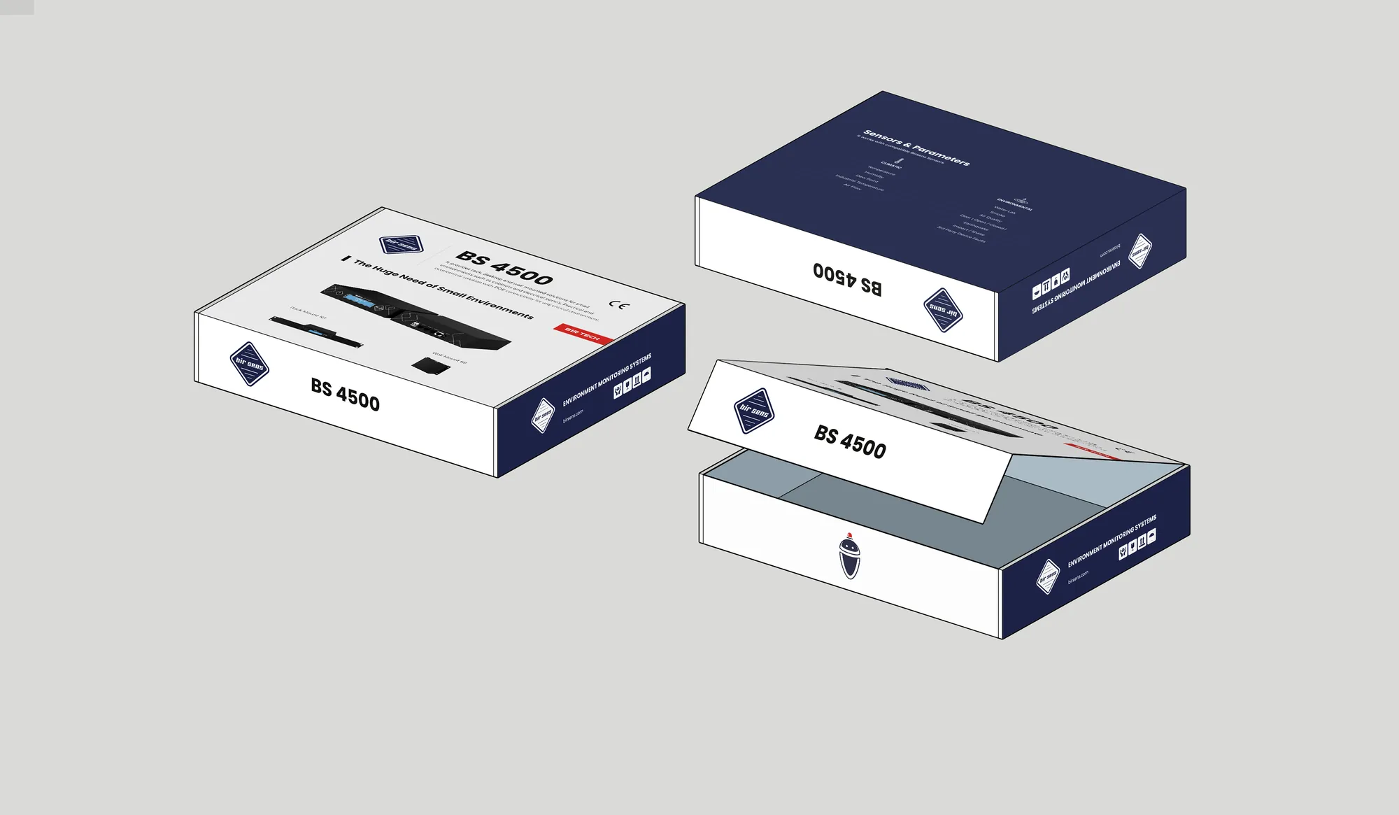
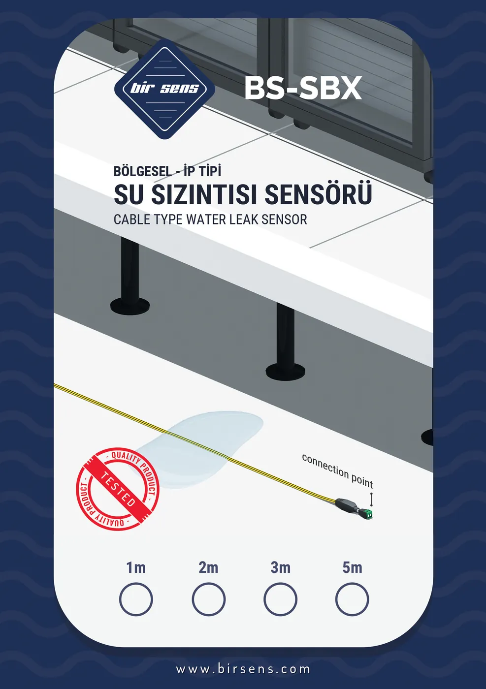
Hardware needs a box. The BS 4500 monitoring unit got a sleeve, a product shot and a spec panel; the BS-SBX water-leak sensor a hang card with its cable length ticked off right on the pack.
Product catalogues
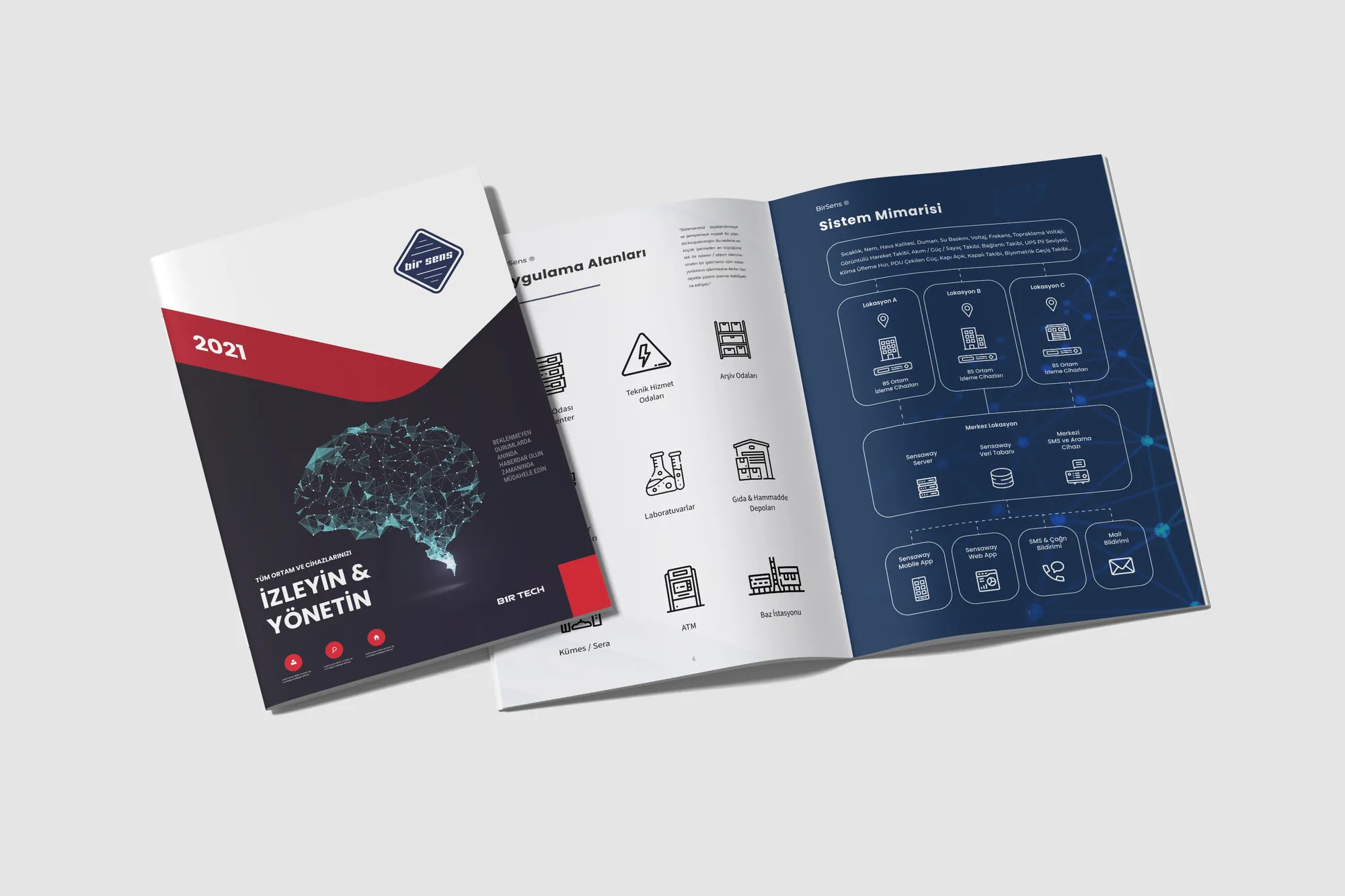
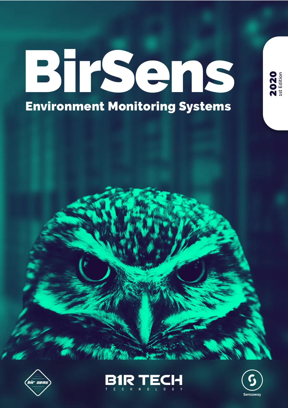
The BirSens product catalogue, from its first English edition in 2020 to the 2021 issue and its system-architecture spread.
3D product renders
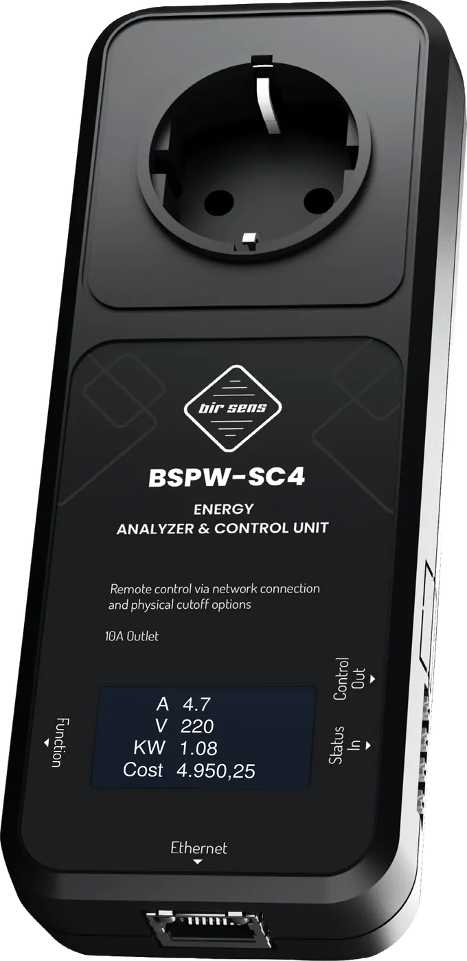
Renders of BirSens hardware, from an eight-port smart PDU and the BSPW-SC4 energy analyser to the SensPoint wireless sensors, so the products can live in catalogues, decks and on the web.

SensPoint logo & device graphics
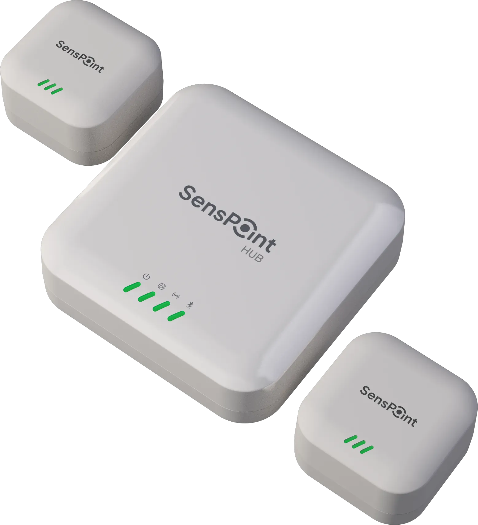
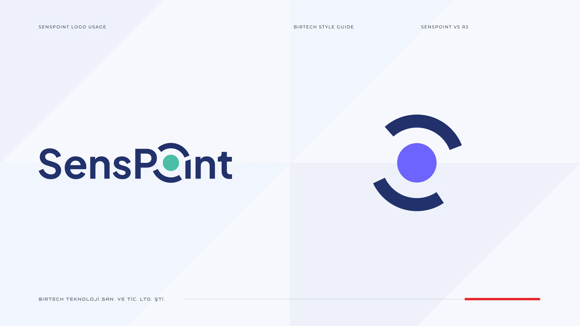
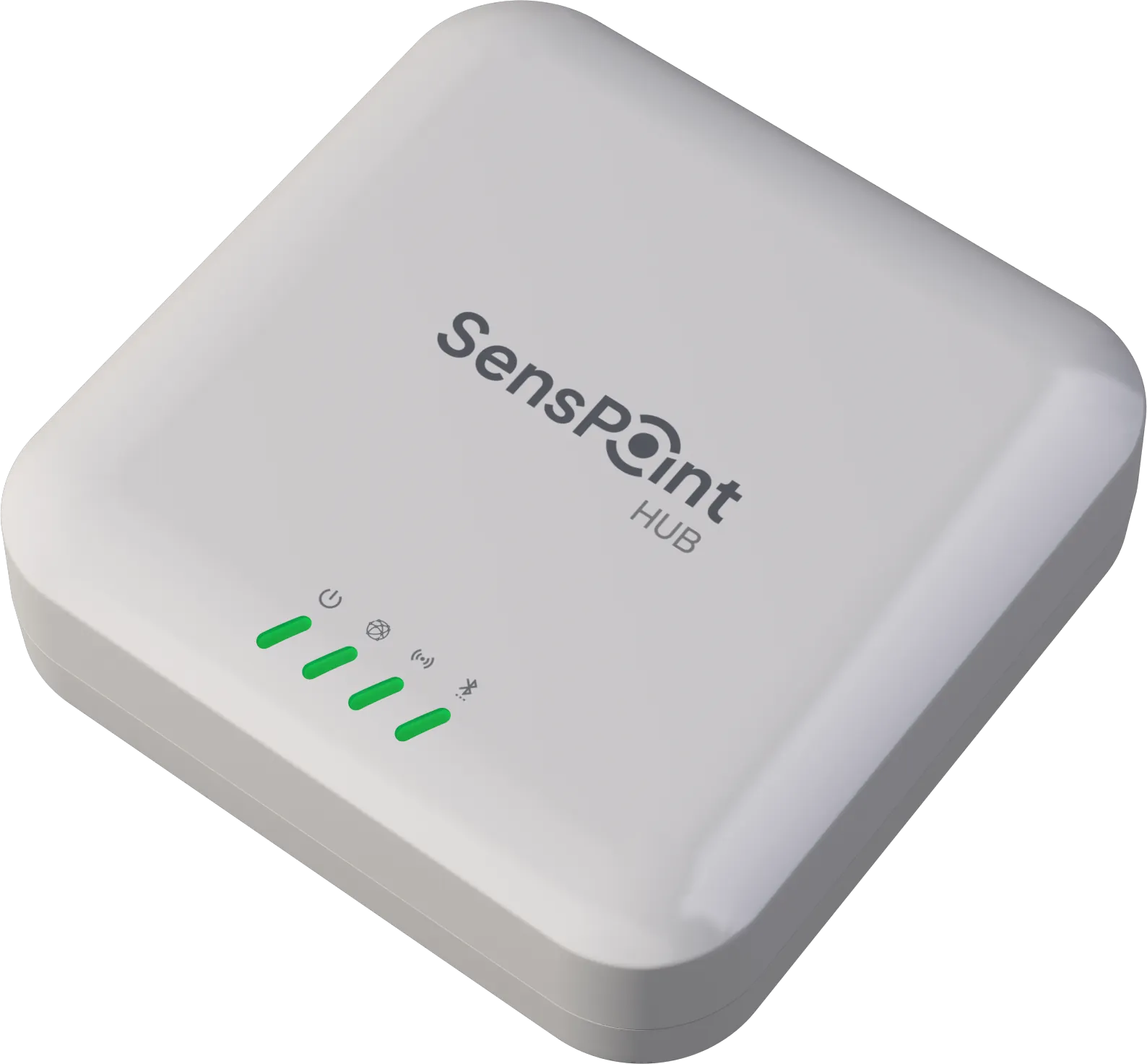
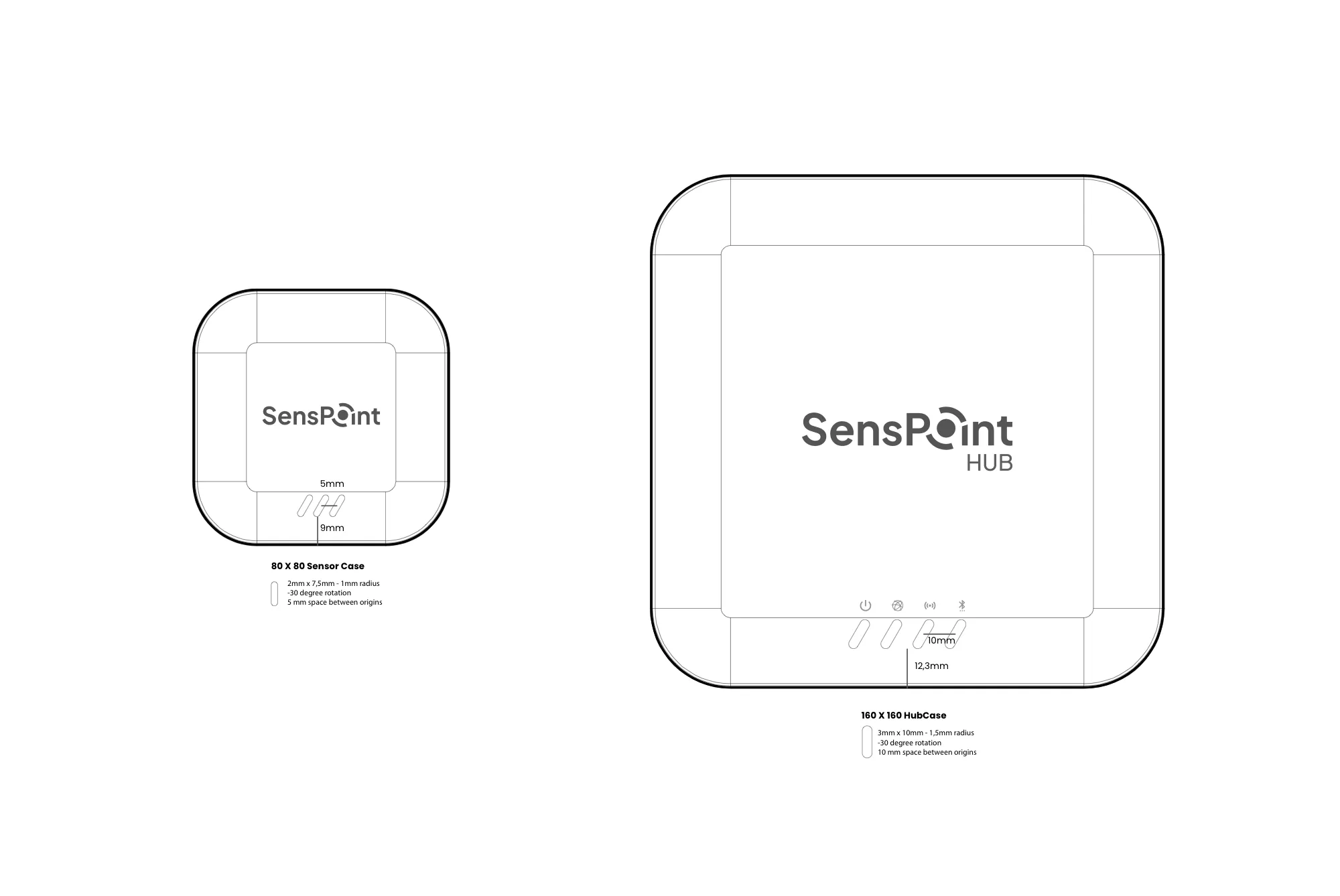
SensPoint is Birtech’s wireless sensor line. Its logo turns the o of Point into a dot held by two broken rings. On the devices the wordmark turns grey and sits on an 80 mm sensor and a 160 mm hub, above LED slots angled at −30° and drawn to the millimetre, then rendered in 3D.
2026 sales deck
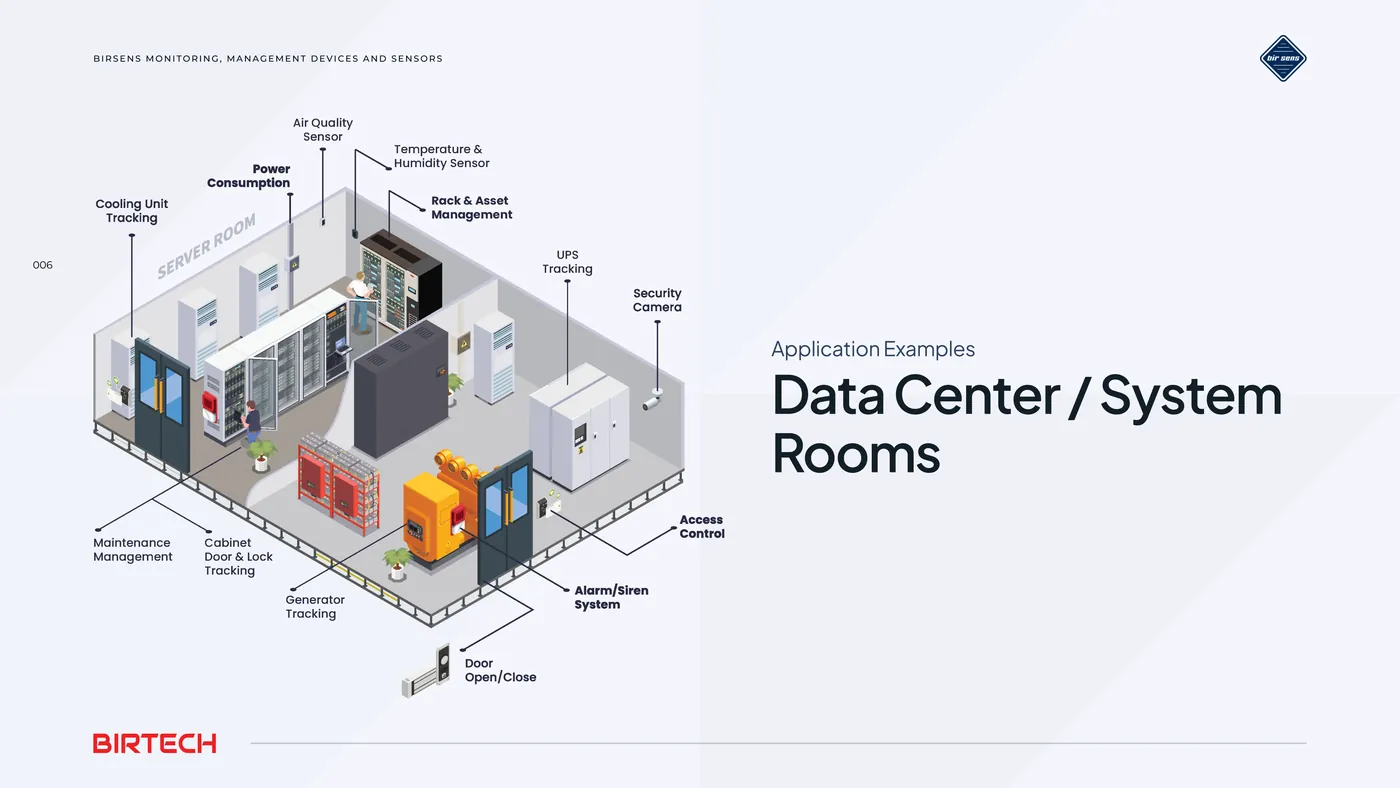
Forty-two slides in the new identity, from the brand family on the cover to an isometric data centre that shows where every sensor goes.

The method behind it
- 2015First identities & marketing
- 2020Corporate identity
- 2020–22Product catalogues
- 2021Device packaging
- 2025Rebrand, guideline v2
#062B59navy#E32026red#0056B3blue#F6F8FEpaperNavy carries, red signals. The same two colours had to work on a 3 cm device label, a printed catalogue and a sales deck on a conference screen.